 It’s easy for readers to take the number of choices we take for granted.
In the age of digital content, customization has become so ubiquitous that most of us have forgotten a time where there was only one way to interact with written information: the way the publisher intended.
From simple tweaks, like setting your browser’s zoom-level, to more granular ones like your e-book reader’s text alignment and font, creating your “ideal” reading experience is just a view clicks or taps away.
However, with the number of options for customization that we have, often comes the temptation to customize simply for the sake of it. Collectively the team at Edition Guard have lost count of the number of times we selected a new font for our e-book readers, with the most popular justification for doing so being: “I remembered that I could.”
This made us wonder whether there is such a thing as an objectively “better” font for reading an e-book in. Our initial suspicion was that this might prove to be a difficult topic to research since what determines an ideal reading experience for one person may be very different to another’s.
These suspicions were confirmed when we stumbled across this quote from notable typeface historian and designer Charles Bigelow:
“I recently read nearly every important book, and many of the important papers, on the study of legibility from 1905 to the present….nearly all the good ones say that it is very difficult or nearly impossible to find statistically significant differences in intrinsic legibility between common typefaces read at common sizes and normal distances,” he said in an academic text he published in 2012.
Well, so much for the “scientific method” then.
The only other option was to take the exact opposite approach: Find out what the people on the internet have to say.
So, herewith then, a breakdown of each font available to most e-book users, along with their respective benefits and drawbacks, as defined by fellow e-book enthusiasts.
Bookerly
History
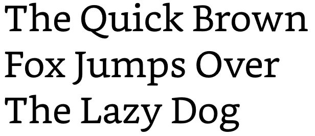
Designed in 2015 by independent font foundry Dalton Maag exclusively for the Amazon Kindle, Bookerly is the youngest font on our list. So invested were Amazon in their creation that the font has replaced Caecilia as the default option in all their future devices. Here’s what the company’s marketing people have to say about the font: “Warm and contemporary, Bookerly is inspired by the artistry of the best fonts in modern print books but is hand-crafted for great readability at any size. It introduces a lighter, more graceful look and outperforms other digital reading fonts to help you read faster with less eyestrain.”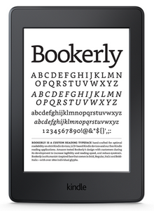
(Source: Amazon.com)
What People Are Saying About It
Having been purpose-built for on-screen display, one would think that Bookerly is the easy choice for e-book enthusiasts. Design writer John Brownlee certainly agrees. “Read Bookerly at much larger font sizes, and some of the fonts delicate touches are allowed to shine: for example, the delicate way the upper arm almost licks the stem of the lower case ‘k’,” he writes in Co.Design. “Bookerly even includes some lovely ligatures that makes reading on the Kindle feel more like printed typography, like the way the terminal on a lowercase ‘f’ will replace the title on the lower case ‘i’, if they are right next to each other,” he adds. “...it’s a lovely font. And in my testing, I thought it was even more pleasant than Palatino, the typeface I previously used on my Kindle.” Piotr Kowalczyk from E-bookfriendly.com praised more than the font’s visual appeal, citing Bookerly’s readability as one of its best features. “The designers of Bookerly font have created a useful visual showing the organic structure of the font. Font serifs are not symmetric, like in Caecilia, the former default Kindle typeface,” he writes. “What’s more, the serif for each letter is different from the others, what helps create a varied flow of the text,” he said, in reference to the image below.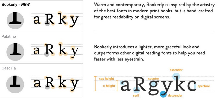
(Source: ebookfriendly.com)
The Verdict
Bookerly is an excellent choice for all compatible devices.Georgia
History
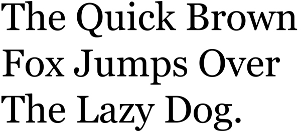
Georgia is the original onscreen font. Designed in 1993 by Matthew Carter, a modern legend in typeface design, its purpose was to be the first serif typeface to be comfortably consumed on a digital display. Unlike the other serif fonts discussed in this post, Georgia features prominent ball-terminals, an attractive design element popular in the “rational” serifs from the early 19th century. Georgia was one of the first popular digital typefaces to feature this element, with Carter saying in an interview that he was “puzzled” over their disappearance.What People Are Saying About It
Roger Packer blogs that it is his first choice, quoting the font’s readability as the main reason for its popularity. “It’s a good, readable serif font that doesn’t impose itself on readers. The main aim with e-book typography is for the reader not to notice what font you are using,” he writes in a comprehensive blog post on digital typography. “ If you use a typeface that annoys readers or that they find even slightly difficult to read, then you are giving yourself problems.” In discussion with Holly Brady, New York art director and author of Typography Essentials, Ina Saltz, also shortlisted Georgia as one of the best serif options for authors who intend to self-publish.The Verdict
An elegant and readable font, ideal for e-books.Baskerville

History
Designed by lacquered-goods tycoon, John Baskerville (1706–1775), this typeface was created as part of an ambitious undertaking he described as follows: “Having been an early admirer of the beauty of Letters, I became insensibly desirous of contributing to the perfection of them,” the former and calligraphy instructor wrote in his preface to Milton’s Paradise Lost.
(John Baskerville in later life, oil on canvas by James Millar.)
A notable difference between Baskerville and other fonts of the era was the increased difference between the letters’ thick and thin strokes, with serifs sharper than its contemporaries.What People Are Saying About It
Baskerville is mostly given credit for being the most ornate and historically significant of the fonts available for selection in most popular e-book readers. “It has respect,” Anna Thompson, Penguin Random House designer told Co.Design, indicating that it would be her choice if she owned an e-book reader. Robert Slimbach, principal type designer at Adobe Systems, is also a fan, but seems to be one of a small group of readers who considers it a comfortable font to read. “Its classical characteristics and open counters make it very inviting to read and less fatiguing to the eye,” he told Co.Design. The font is, however, criticized for some on-screen display issues - most notably as a result of the finer components of the strokes. “ Rather than showing off how nice the display is, Baskerville does the opposite: it shows how relatively crude it is, resolution-wise,” the experts at Daring Fireball say. Joel Friedlander over at Thebookdesigner.com feels that, while it is a fine option for printed medium, its Kindle incarnation is “weak-tea.”The Verdict
A great font for print but not ideal for digital displays.Palatino
History
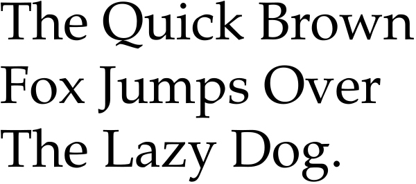
With its creative roots split between Renaissance calligraphy and the distinctive style of its creator, Hermann Zapf, Palatino has a graceful, yet contemporary look even now, more than 60 years after its inception. Palatino eschewed the delicate conventions of its Renaissance-revival contemporaries, opting for a more robust look that aided in its legibility, a factor that has made it a popular choice for digital displays.
(Source: historygraphicdesign.com)


